Followers
Saturday, May 25, 2013
Friday, May 3, 2013
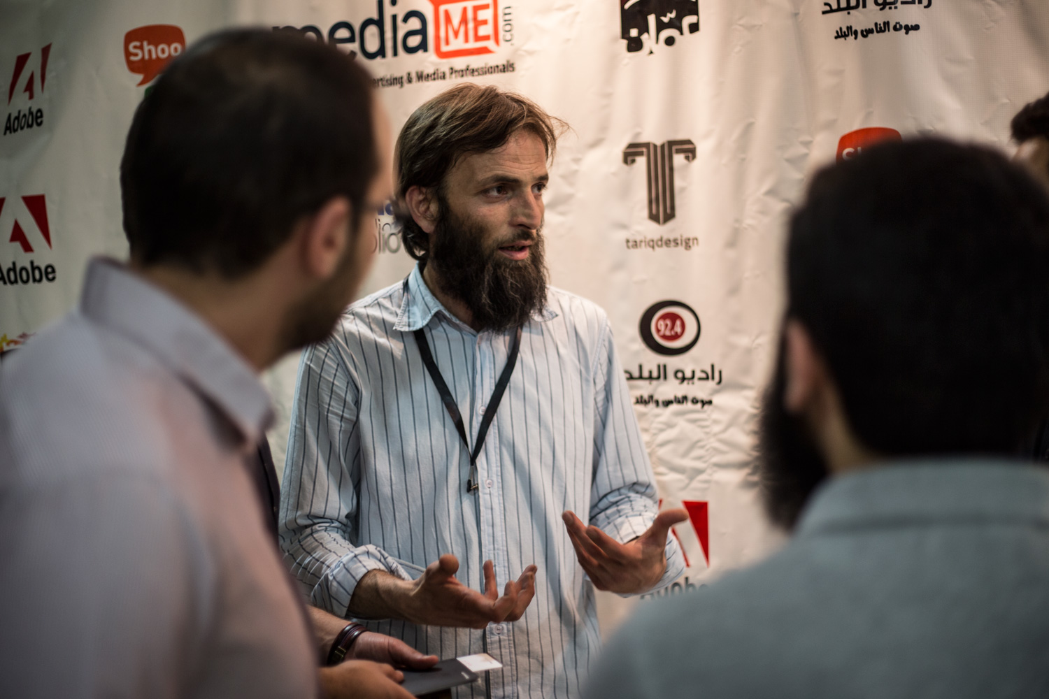
Behance Portfolio Review Amman Jordan
Last year i applied to organize Behance portfolio review @amman and i been confirmed as organizer and in the way cam (adey Ibrahim) and( amr hussien) and made this event possible i could do it without them
Venue:Ras Al Ain Gallery and Hanger - Amman, JordanDescription:Behance Portfolio Reviews bring members together at events in cities and towns around the world, this time and for the first time in Amman Jordan.
For more information and registration, visit
http://www.meetup.com/BehanceReviews/Amman-JO/
https://www.facebook.com/BehanceJordan
Or call +962 777 267892
info@tariqdesign.com
Address
Ali Bin Abi Talib Street - Opposite to Al Hussien Cultural Center - Ras Al Ain Gallery and Hanger
Tuesday, April 30, 2013
Am organizing Behance prtofoio Amman, Jordan
to day i got behance kit

For more information
+962 777 267892
info@tariqdesign.com
Location: Ali Bin Abi Talib Street - Opposite to Al Hussien Cultural Center Ras Al Ain Gallery
This event is: Public (free)
Event Website: http://www.meetup.com/BehanceReviews/Amman-JO
On Facebook: https://www.facebook.com/events/478752485524093/
On Twitter: @Behance jordan
Saturday, April 20, 2013
Friday, March 15, 2013
The NASA Design Program
Source : http://www.thisisdisplay.org/features/the_nasa_design_program
The National Aeronautics and Space Administration Design Program is a modernist vision for an optimistic future. The logo (often referred to as the “worm”) evokes qualities of unity, technical precision, scientific capabilities and uniqueness. Reduced to its simplest form; the one width, continuous-stroke letters are as contemporary today as when the logo was first introduced by Richard Danne (Design Director) and Bruce Blackburn (Designer) at Danne & Blackburn, New York, NY) more than 37 years ago. How then, in 1992, after 19 years, did such an emblematic design program for a future-oriented Federal Agency be dropped for it’s previous (now current) Insignia (the “meatball”)? What follows is a heartfelt personal account from Mr. Danne on the obstacles and achievements of one of the century’s most important and widely published design programs.
The National Aeronautics and Space Administration Design Program is a modernist vision for an optimistic future. The logo (often referred to as the “worm”) evokes qualities of unity, technical precision, scientific capabilities and uniqueness. Reduced to its simplest form; the one width, continuous-stroke letters are as contemporary today as when the logo was first introduced by Richard Danne (Design Director) and Bruce Blackburn (Designer) at Danne & Blackburn, New York, NY) more than 37 years ago. How then, in 1992, after 19 years, did such an emblematic design program for a future-oriented Federal Agency be dropped for it’s previous (now current) Insignia (the “meatball”)? What follows is a heartfelt personal account from Mr. Danne on the obstacles and achievements of one of the century’s most important and widely published design programs.
Thursday, March 14, 2013
Behance Portfolio Review JORDAN
Monday May 13
For all Behance members ( JORDAN)
i received email today
"Congratulations, you've been approved as a Behance Portfolio Review Week organizer!"
http://www.meetup.com/BehanceReviews/Amman-JO
Location:
Amman, Jordan
Sunday, March 10, 2013
Minimalist and flat
Source abduzeedo
“One of the new trends in terms of digital design, especially interface design, is the return of simple, flat and typographical design. We can say that Microsoft might have started that back in 2007 when they launched the Zune with its beautiful typographic based interface. Despite the failure of the product, that UI was improved and applied to the Windows Phone and Windows 8 interface design. The iOS on the other hand was always heavily based on photorealistic textures and depth by using gradients, glossy style effects and shadows, however we started to see more and more apps for all platforms adopting a more minimalistic approach.”
There are lots of reasons to adopt a flat design, one of the most important is scalability. When designing for multiple devices it's important to consider ways to optimize the design. For instance, when using solid colors and less image based UI the number of assets necessary to create an app or a website is much lower and therefore the footprint of the app/website much smaller.
In this post we want to feature some beautiful designs that illustrate this trend. The images are from Dribbble and make sure check out the thumbnail to visit the authors page for more information
_
"Flat design is a label the community has adopted for designs leaving behind drop shadows, subtle textures and gradients in favour of solid colours, clean layouts and sharp typography, somewhat similar to the design of Windows 8 and the Metro UI"
see samples Below
Subscribe to:
Posts (Atom)
-
I have one for sell if any one intersted conatct me (used and working ) Braun, Electric Shaver Sixtant SM31 (1962) 196...
-
Neue Grafik New Graphic Design, Graphisme Actuel, No. 1, September 1958 Cover Designer Carlo Vivarelli (1919–1986) Editor Ri...
-
Loud and soft, dark and light, big and small. Each is a relative measurement of some quality on some scale. Day doesn’t exist without nig...


.png)


